The Psychology of Color in Marketing
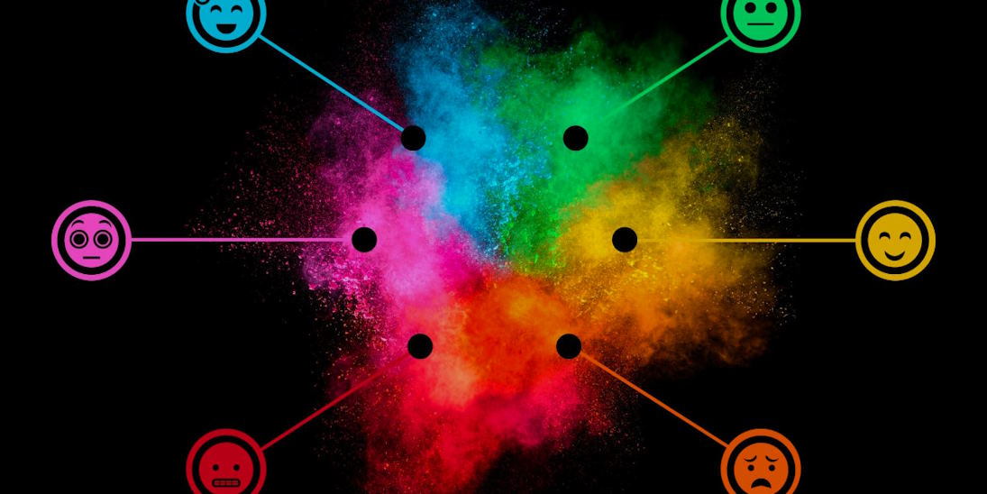
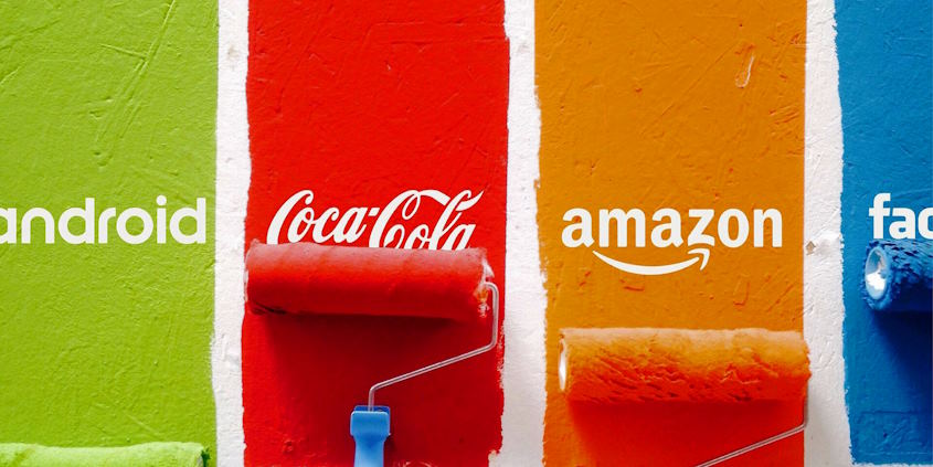
Colors wield a subtle yet profound power, reaching deep into our subconscious and evoking emotions that often go unnoticed. This phenomenon is at the heart of the psychology of color in marketing – a fascinating exploration into how the hues surrounding us can shape our perceptions, influence our decisions, and ultimately guide our interactions with brands.
What psychological associations are commonly linked with different colors?
While there is no one-size-fits-all answer, certain colors are often associated with specific emotions and can be strategically used in marketing:
Blue
Blue’s calming and trustworthy nature makes it a go-to choice for industries where establishing credibility is crucial. Financial institutions, tech companies, and healthcare providers often use blue to convey reliability and a sense of security. Lighter shades of blue can create a soothing effect, while darker shades evoke professionalism.
Red
Red’s dynamic and attention-grabbing quality makes it ideal for creating a sense of urgency and excitement. It’s commonly used in clearance sales, promotions, and calls to action. Red can stimulate appetite, making it popular in the food industry. It also has associations with passion and love, making it suitable for entertainment and romance-focused brands.

Green
Green’s association with nature and growth aligns well with eco-friendliness, health, and well-being industries. Brands that emphasize sustainability and environmental consciousness use shades of green. It can also symbolize freshness and renewal, making it a versatile choice.
Yellow
Yellow’s cheerful and energetic quality evokes positivity and happiness. It’s effective for catching attention and is commonly used for highlighting important information. Brands targeting a youthful and vibrant audience often use yellow to create an inviting atmosphere.
Pink
Pink’s gentle and sweet quality is often associated with playfulness and innocence. It’s commonly used for products targeting a feminine audience, such as cosmetics and fashion. The shade of pink can influence its emotional tone, from energetic and vibrant to calming and soothing.
Black
Black’s timeless and powerful appeal conveys elegance, authority, and exclusivity. Luxury brands commonly use it to enhance the perception of value and prestige. Black creates a sense of sophistication and mystery, making it an excellent choice for high-end products and services.
White
White’s association with purity and cleanliness makes it a versatile color for simplicity and neutrality. Healthcare and technology industries often use it to create a clean and modern look.

